Why do my colours look muddy?
This is one of the most common frustrations in painting.
You choose colours you like.
You mix carefully.
You try to create harmony.
But once the paint is on the surface, something shifts.
The colours lose clarity.
They feel dull or heavy.
They don’t have the energy you expected.
Instead of working together, everything starts to collapse into a similar tone.
My Perspective
I’m Gosia Margie Witko.
I help artists understand what’s happening in their painting so they can develop their work with more clarity and control.
My background spans over four decades across design, technology, and consulting, where I focused on building systems that bring clarity to complex problems.
Alongside that, I’ve always maintained a personal art practice — exploring colour, materials, and process in a way that focused less on perfection and more on observation.
Over time, I became less interested in which colours to use and more interested in how colour actually works inside a painting.
That shift changed everything.
What “Muddy Colour” Really Means
When artists say their colours look muddy, they are usually describing a loss of clarity.
The colour no longer feels distinct.
It doesn’t hold its position.
It feels mixed in a way that dulls its presence.
But muddy colour is not caused by one simple mistake.
It’s the result of multiple relationships breaking down.
The Most Common Causes
1. Overmixing
This is the most obvious cause.
When too many pigments are mixed together, the colour begins to lose intensity.
Instead of clarity, you get a neutral or dull tone.
But this is only part of the problem.
Because even with minimal mixing, colours can still feel muddy.
2. Similar Value Levels
If your colours are too close in lightness or darkness, they begin to blend visually.
Even if they are different hues, they won’t feel distinct.
This creates:
low contrast
lack of separation
and a painting that feels heavy
3. Weak Colour Relationships
Colour does not exist in isolation.
Each colour is affected by the colours around it.
If the relationships are unclear, the colours begin to interfere with each other.
This can create a feeling where:
nothing stands out
everything feels muted
the painting loses energy
4. Temperature Confusion
Warm and cool relationships are essential for clarity.
If all your colours sit in a similar temperature range, the painting loses movement.
It becomes visually compressed.
Even strong colours can feel dull if temperature relationships are unclear.
5. Layering Without Structure
When layers are added without considering what is underneath, colours can become muddy over time.
This happens when:
wet paint is blended unintentionally
layers are added without clear direction
too many adjustments are made without stepping back
The result is a surface that feels overworked.
Why This Keeps Happening
Many artists try to fix muddy colour by:
buying better paint
using more vibrant pigments
following colour mixing charts
But the issue is rarely about the materials.
It’s about understanding how colour behaves in context.
Without that, the same problem repeats — even with better tools.
A More Useful Way to Think About Colour
Instead of asking:
“Why do my colours look muddy?”
A more helpful question is:
“How are my colours relating to each other?”
This shifts your focus from individual colours to the system as a whole.
You begin to see:
where contrast is missing
where colours are competing
where relationships are unclear
And from there, you can make intentional changes.
What to Look For in Your Painting
When your colours feel muddy, pause and observe:
Are my values clearly separated?
Do I have enough contrast between light and dark?
Are my colours too similar in temperature?
Are certain areas overmixed or overworked?
Do my colours support each other, or cancel each other out?
These questions reveal what’s happening.
The Role of Limitation
One of the most effective ways to improve colour clarity is to limit your palette.
Fewer colours create:
clearer relationships
stronger contrast
more intentional decisions
When you remove excess options, you begin to see more.
This is not restriction.
It’s focus.
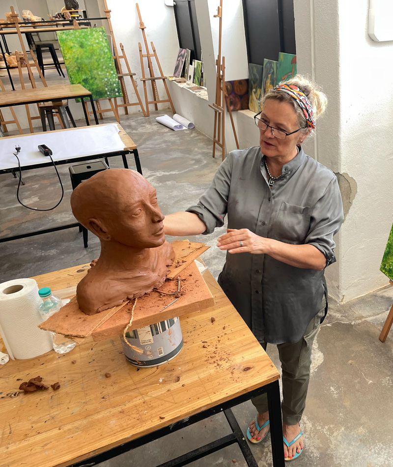
My Approach
This is how I structure my work.
Not around colour recipes.
But around understanding.
Each exploration begins with a question.
A question that helps you see what’s happening.
For example:
What happens when I work with only warm and cool variations?
How do values affect colour clarity?
What changes when I reduce my palette?
These questions guide the process.